Wednesday, 25 January 2012

deconstruction of two magazine covers


One of the magazines I have chosen is Vibe. The music they promote is R'n'B and hip hop artists which is the music audience I want to use in my magazine. This cover inspired me as I liked the consistent type of font for the heading it uses. This is how people recognise that it's Vibe which is a unique thing about it. The cover never looks too busy and always two consistent colours throughout. One thing which makes a cover eye catching to their target audience is colour. If there are more three colours used, then wouldnt appeal to their target audience and is unlikely for them to make any sales. Talking about sales, their magazine cost £4.00. This is cheap as compared to other music magazines and is one of the best selling. Also, in every Vibe magazine, the artist that is on the front page always overlaps the heading, which was another reason why it inspired me. That's what I want to do in my own magazine with the use of two consistent colours. In their magazine, they include a gossip column which intrigues the reader to read more their artisit which makes them feel involved as they know more about what is going on about them.


Another magazine cover which inspired me was 'The Source'. The also promote hip hop music and first started in 1988. While researching about this magazine, I found an interesting fact about it. I found out that 'The Source' was found as a newsletter when it had first started (1988). As you can see, the heading is in front on Lil wayne (the artist) However, if you look at other magazines produced my 'The Source', they own use this type of layout very rarely and use the type of layout 'Vibe' uses (the heading behind the artist). Their heading is bold as though it has been stamped in compared to vibe. One thing which attracted me to this magazine was the matching colours. Lil wayne is wearing a red hat which matches with background of the font used. There are three colours here red, black and white which all go together well. There not too bright and too colourful althought it is busy. I've realised in most of the front covers, they use a close up shot of the artist which is another difference between the two well know, popular magazines. So you must be thinking about how much it costs? Well, the price is £3.95, cheaper than vibe but good quality. 'The Source' is exclusive and different from vibe as it has its own radio and TV station.

Friday, 20 January 2012

Mine & Maria's Music Research Magazine


Preliminary Task - contents and front cover

This is my final front cover for my preliminary task. Choosing an appropriate colour scheme took me quite some time to do. However, I used red and chose colours from the image of the girl wearing the shirt which shows enables my magazine to flow. The blue star matches with the colour of the shirt with the image of the guy which also enables it to flow. By putting the line underneath my title, it makes it stand out. Without out, it would look as if it is floating. I feel as if it was unnecessary using the page number below each of  the story lines. Also, looking at it now, I would've been better if I cropped the image out which would give me more space for text as it looks quite plain. Overall, I happy with my end result, but I believe there was room for improvement if I had enough time.


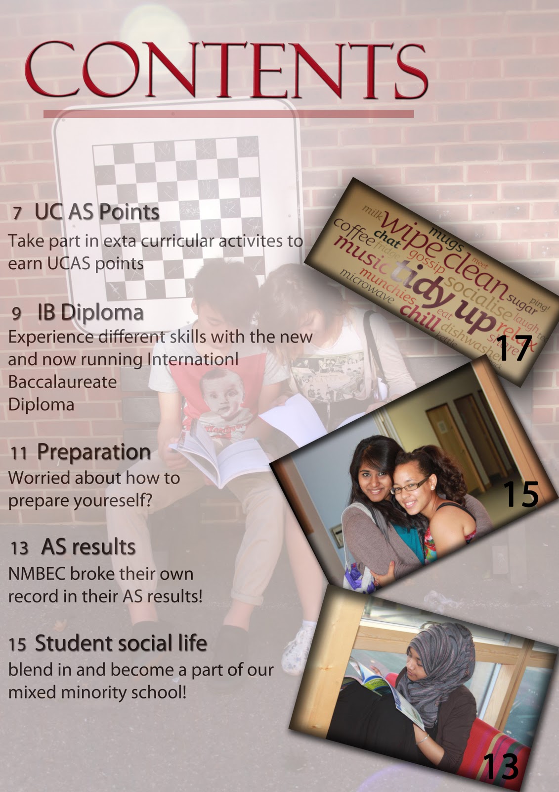
I didnt keep consistency through out which made my magazine look unprofessional. I tried to make my pictures not float by adding a boarder around it which made it stand out much more. However, the line underneath the 'contents' shouldn't of have been faded out as it loses the boldness of the title. I took more pictures for my contents page rather than my front cover which was a problem. This is because I could choose from much more in contents page than in my front cover which didnt give me much of a variety. The starting numbers are not in line and I should've used to a ruler to measure everything out.

Wednesday, 18 January 2012

Music Magazine Project

Today we were introduced to our new project - to create a music magazine. We have to create, the front cover, the contents page and a double page spread for our magazine. Our teacher showed us in lesson today both good and bad examples of previous music magazines students had created. This gave me a rough idea on the layout of my front page, the contents pages and the double page spread which made me aware of what not to do. Our teacher gave us a task. Our task was to get into pairs and chose a well known magazine (from the choices that were on the board) to talk about by friday.

Monday, 7 November 2011

Independent Record Label - Street Soul Productions

Street Soul Productions is an independent record label which was first established in 2005. It's based in London and California and was created by James Kennaby. Street Soul Productions orginated from Birmingham which involved artists from all over the world helping singers, DJs, Producers and emcees. This helped them create a unique brand of Hip Hop for the future.


Street Soul Productions run workshops! These workshops specialise in Apple mac software (music), Adobe photoshop (graphics) and Final Cut Pro (editing). They also offer team building exercises which will help you gain the skill to work better in teams, lyric writing and creative writing sessions. Street Soul Productions help all age groups from infants to adults varing from different ability levels.
They broadcast their music through TV, radio, the film industry and more. This is a great way for people to recognise how much they have to offer.

EMI

EMI was found by the inventor of the gramophone, Emile Berliner during the 1990s. Since then EMI has always been at the front of technology. EMI scientists invented stereo recording and of electrical television.
It is the fourth-largest business group, family of record labels and one of the "big four" record companies.


EMI owns EMI Music Publishing. This is known to be the largest music publisher in the world. It has won the 'Music Week' Award for publisher of the year each year over the past 10 years. In 2009, for the first time ever, the award was shared with 'Universal Music Publishing'.

Wednesday, 2 November 2011

Article extract from XXL

My magazine I purchased of my choice was 'XXL', I chose this because it included RnB celebrities and this type of music interests me.

An article that most interested me was a short summary about 'Don Trip'. As I have neveer heard of him before, this was a new and exciting experience for me.

Don Trip is currently a rapper who raps about his life. He expresses his pain through his lyrics and this was one of the things that inspired me. He made a video recently for his song 'Letter to my Son'. This rap expressed his love for his son and how the mother of his son is keeping them apart. One of his quotes that got me intrigued to read more was 'I fell in love with how fast the money was comin', but I never loved it'. This shows that the majority of the celebrities that are currently out there have so much money, but aren't happy with this. This explains the famous quote 'money can't buy happiness'.