Wednesday 25 April 2012

Evaluation


The evaluation above consists of all the work I have done throughout the process of constructing my front cover, contents page and double page spread. It explains my chosen genre, research I have done (survey monkey questionnaire), the steps towards my final pieces, what I learnt, what technologies I have used to constructs my final products, a music video relating to my chosen genre and the title of my magazine and the feedback I got from fellow peers.

Sunday 1 April 2012

Double page spread - completed


So, this is my double page completed. Although my original idea didn't quite go to plan, I believe the outcome of the change is much better than I expected! As you can see, I've consistently used the three same colours (gold, black and white) which shows consistency. Similarly, I've used the title 'swag' on all three of the pages (front cover, contents page and double page) which also shows consistency. By using pictures of two sides of his personality on all three of the pages is another factor I decided to keep the same throughout. My initial idea was to put both images on one half of the page and the put all the text on the other side of the page. I got this idea from the magazine 'XXL'. Although this was a convention, my teacher gave me advice that I should change it so it looks unique. However, if I had a little more time, I believe I would change a few things as time was a problem for me.

Saturday 24 March 2012

The final step...

The hard work's not over yet! It's time for me to complete my double page spread. I've started it, but it's not quite complete yet. For my double page spread,  I haven't followed my flat plan as I changed my idea to something better and unique. While doing my flat plan, the layout wasn't thought out which was maybe why I did not initally stick to my original idea. I plan to use the same colour scheme (gold, white and black) and the title of my front cover as this shows consistency.

Contents page - completed

This image above is what inspired me on the layout of my contents page. 


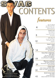
So my Contents Page is now finished.I am happy with the outcome but if I had more time, I would change the picture of him on the left. This is because the image is darker than the image on the right. However, to try and make both the images match, I used played around the colour to ensure both images are the same gradient. I done this by using photoshop. I done this by using the image tool and using the adjustments to play around the gradient, the brightness, the contrast until both images look similar. However, I wanted to include an editors note, but there was not enough space. By adding a drop shadow around both images, it shows the images are not floating and makes it stand out much more. By adding lines to seperate the features, it organises the layout of the text. Now looking back, the '17' does not stand out which if I could re do, I would add a drop shadow to make it stand out much more. I believe the masthead of the 'contents' could be much more bolder and I would change it. However, I believe more thought could've gone into the layout as there is not much really going on.
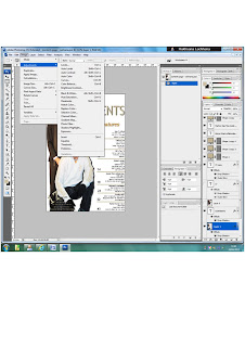
The print screen here explains on the tool I used to brighten my pictures. I had to change the brightness/contrast because originally, both images were not the same. However, if I had more time, I would have used Picasa. This programme is much more professional in terms of brightening and changing the colour of the images. However, I am happy with the outcome of both of images and the layout.