Wednesday 25 April 2012

Evaluation


The evaluation above consists of all the work I have done throughout the process of constructing my front cover, contents page and double page spread. It explains my chosen genre, research I have done (survey monkey questionnaire), the steps towards my final pieces, what I learnt, what technologies I have used to constructs my final products, a music video relating to my chosen genre and the title of my magazine and the feedback I got from fellow peers.

Sunday 1 April 2012

Double page spread - completed


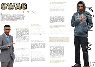
So, this is my double page completed. Although my original idea didn't quite go to plan, I believe the outcome of the change is much better than I expected! As you can see, I've consistently used the three same colours (gold, black and white) which shows consistency. Similarly, I've used the title 'swag' on all three of the pages (front cover, contents page and double page) which also shows consistency. By using pictures of two sides of his personality on all three of the pages is another factor I decided to keep the same throughout. My initial idea was to put both images on one half of the page and the put all the text on the other side of the page. I got this idea from the magazine 'XXL'. Although this was a convention, my teacher gave me advice that I should change it so it looks unique. However, if I had a little more time, I believe I would change a few things as time was a problem for me.

Saturday 24 March 2012

The final step...

The hard work's not over yet! It's time for me to complete my double page spread. I've started it, but it's not quite complete yet. For my double page spread,  I haven't followed my flat plan as I changed my idea to something better and unique. While doing my flat plan, the layout wasn't thought out which was maybe why I did not initally stick to my original idea. I plan to use the same colour scheme (gold, white and black) and the title of my front cover as this shows consistency.

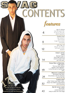
Contents page - completed

This image above is what inspired me on the layout of my contents page. 


So my Contents Page is now finished.I am happy with the outcome but if I had more time, I would change the picture of him on the left. This is because the image is darker than the image on the right. However, to try and make both the images match, I used played around the colour to ensure both images are the same gradient. I done this by using photoshop. I done this by using the image tool and using the adjustments to play around the gradient, the brightness, the contrast until both images look similar. However, I wanted to include an editors note, but there was not enough space. By adding a drop shadow around both images, it shows the images are not floating and makes it stand out much more. By adding lines to seperate the features, it organises the layout of the text. Now looking back, the '17' does not stand out which if I could re do, I would add a drop shadow to make it stand out much more. I believe the masthead of the 'contents' could be much more bolder and I would change it. However, I believe more thought could've gone into the layout as there is not much really going on.
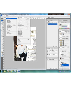
The print screen here explains on the tool I used to brighten my pictures. I had to change the brightness/contrast because originally, both images were not the same. However, if I had more time, I would have used Picasa. This programme is much more professional in terms of brightening and changing the colour of the images. However, I am happy with the outcome of both of images and the layout.

Friday 16 March 2012

The next step...

My front cover is finally finished! Now it's time to complete my contents page. One problem I encountered was  I forgot what font I used for my title on my front cover. So, as a result, what I planned originally to do didn't go quite to plan! Panic struck and I didn't know what to do. However, a convention that is used in many magazines is that they put the title of their front cover on their contents, but smaller than how it is portrayed on the front so it doesn't stand out as much. 
This is my unfinished version:
My completed version would be finished by Monday. 

Monday 12 March 2012

Steps towards my final piece - front cover

Originally I had planned to go with a different picture that is currently on my front cover. The reason behind this is while I was showing my pictures to my teacher, she pointed out a picture that was a good potential shot. So as a result, I decided to go with her idea. The other image of Bilal M wearing a white jacket took me ages to cut out! After eventually cutting it out, I encountered a problem. Due to the jacket being white, it blended into the background so I had to put a shadow around it to make it stand out.
Here is what I was going to go with:                                 This is the picture that worked better:  

Getting a right colour scheme took me ages to do! Because my original colour scheme was yellow, white and black, I realised while adding the colours that yellow doesn’t work on well on a white background as the text was not readable. So, while experimenting with colours, I came across gold. I got this idea from the stripes on his white jacket. My title originally didn’t have the bold lines around it. This was due to the fact that I didn’t pay much attention to the title. My teacher gave my some advice and told me that the title doesn’t stand out and I should do something to make it big and bold. One thing which I found interesting was the positioning of the title. I had it in the middle and my teacher told me that normally on magazines, the title is not normally placed like this. I made it bigger to go across the top and realised that the title made my whole front cover stand out!
Normally the price is either on top or besides the barcode but nor black or gold stood out! Gold represents wealth and money which goes with the image of him wearing a suit. Black didn’t stand out due to the black suit Bilal M is wearing. Looking back at the magazine that inspired me, I realised that the issue date and the price was at the top underneath the title. This gave me an idea to add in my issue date and where to place my price. While doing my survey, one of my questions was ‘how much would you pay for a magazine?’ and one of my options was 50p-£1.00 and the majority of people chose that option. However, I believe that it is too cheap so I changed the price to £2.50.

These were steps towards my final piece:


I first started off by looking for a masthead on dafont.com. As my magazine is based on rnb genre, I was planning to use a graffiti font. However, I came across this font which stood out much more so I decided to go with this. I then cropped out both images on Photoshop. I added a shadow on the second image because as he's wearing white, he blended into the background which was a problem. 


I then added the lines to where I should place my text. I used the colour gold as it represents, money and wealth. Also, as his jacket has gold lines which automatically blends in.


I started to experiment with the backgrounds. I couldn't go with too bright colours as it would look colourful and that's not a convention of a rnb magazine. As he's wearing a black suit, I thought a black background might work. However, I didn't like it and decided to change it back to white.


This is my final piece. I added a bar code, the price, the issue date and current, fresh artists at the bottom.
Most rnb magazine that I've looked at, had this at the bottom which makes it a convention. I am happy with my final piece, but I believe if I had a little more time, I would've maybe changed a few things and moved a few things around.

Tuesday 28 February 2012

Experimenting with the camera!

So during the past few days, I've been taking pictures for my front cover, contents page and double page spread. I can now say that I much more familiar with the camera than I was at the beginning. By familiarizing myself with the camera, it has enabled me to produce potential shots that I want to use in my magazine. I have used two types of shots which are long shots, mid shots.  I have used these two particular shots because they are both very common in R&B (my chosen genre) magazines. While taking pictures, I experimented with the lighting. I took a few with a light shining at his figure, then I took others outside. By doing this, it made me realise how lighting affects your image, which place was better and which one was not. I decided to take lots of images as it gives me a wide range of what to choose from. Here are all of the images I took:


While taking my pictures, I thought about the location of where my artist would be placed. Also, different locations had different lighting so this enabled me to pick out key images that I thought would work well for my front cover and the main image is the important. While, taking my pictures, I ensured I took it with a clear background as this would make it easier for me to cut out. To ensure my pictures were good, I asked my teacher for his opinion on what he thought of them. He told me I should add an item on the artist like an era cap, a watch etc. I took this information into account and made my artist wear a watch which is shown in my double page spread. I realised that it made my image stand out and I wish I had done this for my front cover as my double page spread images are much stronger than the ones on my front cover. In many music videos I have realised that most of the artists have an item whether it be or a chain or ring, it makes them stand out much more than them wearing nothing at all.

Friday 24 February 2012

Front cover pose

After a lot of thought, I have finally decided my layout for my front cover! I have stuck to the same colour scheme (yellow, black and white) and I think my idea is effective and hopefully it will attract potential customers. I have taken parts of the magazine I got my inspiration and use some ideas of my own to create my overall front cover. As I have only use Photoshop once (for my prelim last year), I do realise that I have to use my own time out of school to make this the best it can be. I will get help from my teacher and I will be taking pictures of Monday as my model is not ready yet. By using some of my own ideas as well as theirs, it give my magazine that unique touch. Here is the front cover that inspired me:

Thursday 23 February 2012

Shot list

Front cover
On my front cover, I have decided my colour scheme to be black, white and red. However, as this is a common theme amongst many students in my class, I want to change it to white, black and yellow. I want my magazine to be unique and different from everyone else's. I got my inspiration from the music magazine 'Flavour'. As it being one of my favourite magazines of all time, I aim to create a magazine similar to Flavour by using Photoshop. However, I am aware that I need to be careful not to recreate the magazine. My artist will have two sides to him, good and bad.

Double Page Spread
My original idea on my double page spread was to include my artist sitting down, looking down against the wall which would be placed on the left hand side. However, I also found out many people had this exact idea so I decided to change it. After thinking, I want to either have one whole page dedicated to the image itself. Or have the artist posing after the wall white different shots underneath it. I got my inspiration of using one page for the image itself from the magazines Flavour and Vibe.

Contents Page
As Vibe is my favourite magazine, I didn't like the layout of the contents page. This is due to the fact of the way the title is written. In my opinion, I don't think it is very effective. I have decided to keep my magazine very simple as making it too busy might not attract potential customers.

Sunday 19 February 2012

Name of my magazine

For my magazine, I've decided on the name 'SWAG'. This is due to the fact of today's society and how artists get recognised. They don't only get recognised by their voice, but the way they dress. For example, Lady Gaga is known to be extravagant in what she wears. By doing this, it makes her become known for what she wears which symbolises her uniqueness. Another well known artist is Nicki Minaj. She is known for wearing unusual but yet again unique clothes which makes her what she is today. With today's technology, your voice can be changed into something it's not. That's why when many artists peform live,  they don't sound as good as in their songs.
'Swag' in slang means the way you dress. In other words; how you present yourself and normally if someone is dressed nicely, people will say you've got 'swag'.

Friday 17 February 2012

Reader Profile

Zara is a 17 year old who is currently studying A levels in Media, Music and Business Studies at sixth form. She is interested in RnB/Hip Hop music and spends her free time reading magazines such as Vibe and Flavour as they cater for the similar genre. She prefers magazines with interviews, gossip about different artists and upcoming albums.  These factors would draw her attention into buying a magazine. Her favourite artists are Beyonce, Rihanna, Tinnie Tempah, Chris Brown and Alicia Keys and aspires to be as big as them in the near future. Zara is currently taking private singing lessons at home. This will prepare her well enough for her next step into the music industry as she hopes one day to become a singer. As she is very passionate about music, she promotes her music through Facebook, Youtube and SoundCloud in hoping she gets recognised. My music magazine will appeal to Zara as I will be catering for RnB/Hip Hop music and it will also include top tips from well know aritists on how they got as big as how they are today and what others who are willing to enter the music industry need to do to get there.

Monday 13 February 2012

Flat plans


These were my flat plans. My first image I had inspiration from the music magazine ‘Flavour’. This was the only flat plan that went to plan as my final products looks completely different. The other three images did not go to plan. I believe that my final products look much better than my flat plans. I have realised that plans don’t always work and change is sometimes change for the better and in this case, the change that occurred was for the better. The reason why my flat plans maybe did not quite go to plan was due to lack of research. While doing my flat plans, I did not conduct as much research I should have done. I did not put much thought into it although I knew planning is a vital stage.

Friday 10 February 2012

Pie charts representing my results


After producing my questionnaire, I issued a pie chart which enabled me to structure my results efficiently. By constructing this, it showed me easily what option was most popular from each question. From these results, it allowed me to start producing my magazine. I found that everyone liked the colour scheme 'black, white and blue' and hardly anyone brought a magazine so this enabled me to produce something that's fresh and unique to meet their needs. As I could not decide on a particular colour scheme, I thought it would be a good idea to put this question in my questionnaire although it didn't help me because I didn't use the colour scheme that was most popluar in my questionnaire on my magazine. I thought it was important to ask my audience what type of pose would attract them as I could then use this type of pose in my magazine

Results from my questionnaire

I then checked my account to identify my results 12 days later. From the information I have gathered, I can tell what type of genre of music most people prefer. This gave me a much clearer insight on what genre I would base my magazine on although I knew what I wanted to go with right from the beginning. One of my questions asked my audience what colour scheme they would prefer on their magazine and my audience said ‘black, white and blue’. However as this is a common colour scheme among many magazines, I wanted to go with a unique look. So I came up with ‘black, white and yellow’. But, these three colours only worked with a black background and I wanted to use a white one. While playing around with the colour yellow, I came across the colour gold. I thought this would work with my magazine because it represents money and wealth which relates to my image of him in a suit.

Thursday 9 February 2012

Scamps

Yesterday in class, we designed our scamps for my front page, contents page and double page spread. This gave me a clearer insight on how my artist will be portrayed on my front cover, and the layout of both my contents page and my double page spread, although I dont have a fixed decision on the way my contents page is going to be set out. While designing my front cover on a sheet of paper, I looked at different types of magazine covers which helped me bring different components together as one. My scamps will be up soon!

Wednesday 1 February 2012

Use of semiotics in XXL


The magazine XXL relates to the genre that I want to do for my magazine. There are a variety of ways semiotics is presented on this front cover. I am going to deconstruct XXL to show you the ways in which they are shown. From the people used on the front cover, we can tell that they are the class of 2011. Without the text 'class of 2011', we wouldn’t have been able to figure out what year the picture was taken. Unless you look at the barcode which has the date it was issued. However, I only know this due to the text they wrote on right. Without out that, I would've also thought the same. This is because of the books on the desk which suggests they are at school. Many of them don't look very happy which suggests maybe some of them haven't graduated?

The topless man on the front at the right is an artist and maybe the word on the board he's holding suggests that they are his lyrics? The man with the slingshot at the back shows he's the mischievous boy of the class and causes a lot of trouble. If they were smartly dressed without any text, the reader would automatically think that it's a school/class photograph. At the bottom of the magazine, the word 'featuring' is in a different font. This might suggest the producer of the magazine wants the reader to be drawn to the names of the artists in the picture.

Without the text at the bottom, the audience won’t know the names of the artists. The text at the top 'the 4th annual freshmen issue' suggests that the words 'the 4th annual' is more important than the words 'freshmen issue'. I can tell this because the first three words are bigger and the other two which suggests the producer done this purposely to attract the reader. This might be of interest to the reader because it shows that there are more magazines issued before it which may make the reader want to buy the previous editions.

More about the use of words! On the right hand side, there is a use of the rule of three 'rappers, rhyming, and relatives’. The word 'rappers' is bigger than the other two words which suggest the importance.

How I carried out my research...

As part of my research to find out what my audience want, I created a questionnaire. I did it by using a website called survey monkey. At the end of creating my questionnaire, I was given a link that I got people to sign. I posted the link on a social networking site like Twitter. From there, my followers would see this on my timeline and eventually click the link and fill out the questionnaire. I also used BlackBerry Messenger to broadcast the link which I kindly asked the contacts to fill out. Here are some print screens of how I broadcasted it via twitter.


Thursday 26 January 2012

5 different type of magazine titles - similar genre

As part of our research for my music magazine, everyone in my class has to research about 5 different music magazine titles and we have to discuss what their names connote in relation to their magazine. As my genre is hip hop/RnB, I will be looking at a wide range starting from vibe - my favourite!


The title 'Vibe' is always in bold is consistent in every magazine. What I've realised is in the title every letter is capitalized except the 'e' at the end being lower case. It could be to represent the male audience as it big and powerful being capitalized. The title is red which flows with the magazine as there's not a variety of colours used and only two. Red and black are normally a good combination of colours which is very eye catching. This attracts customer and is recognisable from a distance. As red is both a males and females colour, anyone can read it so it appeals to both males and females. The title is behind the artist (Nelly) and is a convention as the same position is in every magazine. I've noticed that in each and every one of their magazine covers, they have used either two/three colours which go well together. Using two/three colours which blend together well, allows the audience to be attracted to it as it isn't busy, being colourful doesn't always appeal to your audience! It's the layout and how it's portrayed attracts your customers in my opinion.
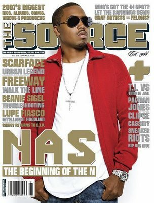


Another music which is a hip hop/RnB based magazine is 'The Source'. The title is large and is sans-serif which makes it looks professional. 'The' in The Source is smaller than 'Source'. This could symbolise that the word 'Source' is much more important than the word 'The' as it's much bigger and bolder. This is eye catching to their audience as it is the first thing they notice after the picture of the artist. The title is positioned behind the artist. Notice, it's the opposite from vibe. They've also used a colour that appeals to both males and females so it attracts both genders. The colour gold connotes wealth and good health which relates to the the artisit (nas). He's a rich, well known famous artist as he has sold over thirteen million records in the United States alone.


XXL is a rap based music magazine. The colours for the title is always white and red. Everytime I look at the title, I feel as though it has been stamped onto the page. Maybe that's what they want there reader to think? White symbolises cleanliness and peace whereas, red symbolises passion but war and violence. The red relates to the picture as his hands are guns which suggest violence and aggression. This could put the customers off buying this particular with this artist on it. However, if the customer is a 'The Game' fan (the artist on the front cover), then they are likely to be attacted to it.


Flavour is another popular magazine that caters for Rnb artists. It's a free magazine which is difference from the ones above. The white, yellow and black colours work well together and are consistent throughout the front cover. Another difference between this one and the others above is that the title is place in front of Cher Lloyd (the artist). The colour white symbolises purity, the colour yellow symbolises joy and happiness and the colour black stability. The hand gesture of her having her hand over the mouth suggests many things. It could either suggest that, she is shocked and she just found out something. Or it could suggest that she is keeping a secret by covering her mouth. One thing that I have realised that throughout Flavour's magazines is that the heading 'Flavour' is always either behind or in front the artist. However, in Vibe, the title is not consistent and is always behind the artist.


The last but no least is 'Respect'. Another magazine that catera for RnB artists. Straight away, the reader is drawn to the image as it's the most important thing. From his facial expressions, you can tell that he is serious. The pull quote used at the bottom left hand corner, shows that he is being boastful about his current position in the music industry. Brown symbolizes self discipline which could link to the serious look on his face. However, there is not a lot of information on the front cover which is one factor that I dont like.
Wednesday 25 January 2012

deconstruction of two magazine covers


One of the magazines I have chosen is Vibe. The music they promote is R'n'B and hip hop artists which is the music audience I want to use in my magazine. This cover inspired me as I liked the consistent type of font for the heading it uses. This is how people recognise that it's Vibe which is a unique thing about it. The cover never looks too busy and always two consistent colours throughout. One thing which makes a cover eye catching to their target audience is colour. If there are more three colours used, then wouldnt appeal to their target audience and is unlikely for them to make any sales. Talking about sales, their magazine cost £4.00. This is cheap as compared to other music magazines and is one of the best selling. Also, in every Vibe magazine, the artist that is on the front page always overlaps the heading, which was another reason why it inspired me. That's what I want to do in my own magazine with the use of two consistent colours. In their magazine, they include a gossip column which intrigues the reader to read more their artisit which makes them feel involved as they know more about what is going on about them.


Another magazine cover which inspired me was 'The Source'. The also promote hip hop music and first started in 1988. While researching about this magazine, I found an interesting fact about it. I found out that 'The Source' was found as a newsletter when it had first started (1988). As you can see, the heading is in front on Lil wayne (the artist) However, if you look at other magazines produced my 'The Source', they own use this type of layout very rarely and use the type of layout 'Vibe' uses (the heading behind the artist). Their heading is bold as though it has been stamped in compared to vibe. One thing which attracted me to this magazine was the matching colours. Lil wayne is wearing a red hat which matches with background of the font used. There are three colours here red, black and white which all go together well. There not too bright and too colourful althought it is busy. I've realised in most of the front covers, they use a close up shot of the artist which is another difference between the two well know, popular magazines. So you must be thinking about how much it costs? Well, the price is £3.95, cheaper than vibe but good quality. 'The Source' is exclusive and different from vibe as it has its own radio and TV station.

Friday 20 January 2012

Mine & Maria's Music Research Magazine


Preliminary Task - contents and front cover

This is my final front cover for my preliminary task. Choosing an appropriate colour scheme took me quite some time to do. However, I used red and chose colours from the image of the girl wearing the shirt which shows enables my magazine to flow. The blue star matches with the colour of the shirt with the image of the guy which also enables it to flow. By putting the line underneath my title, it makes it stand out. Without out, it would look as if it is floating. I feel as if it was unnecessary using the page number below each of  the story lines. Also, looking at it now, I would've been better if I cropped the image out which would give me more space for text as it looks quite plain. Overall, I happy with my end result, but I believe there was room for improvement if I had enough time.


I didnt keep consistency through out which made my magazine look unprofessional. I tried to make my pictures not float by adding a boarder around it which made it stand out much more. However, the line underneath the 'contents' shouldn't of have been faded out as it loses the boldness of the title. I took more pictures for my contents page rather than my front cover which was a problem. This is because I could choose from much more in contents page than in my front cover which didnt give me much of a variety. The starting numbers are not in line and I should've used to a ruler to measure everything out.

Wednesday 18 January 2012

Music Magazine Project

Today we were introduced to our new project - to create a music magazine. We have to create, the front cover, the contents page and a double page spread for our magazine. Our teacher showed us in lesson today both good and bad examples of previous music magazines students had created. This gave me a rough idea on the layout of my front page, the contents pages and the double page spread which made me aware of what not to do. Our teacher gave us a task. Our task was to get into pairs and chose a well known magazine (from the choices that were on the board) to talk about by friday.