Saturday, 24 March 2012
The final step...
The hard work's not over yet! It's time for me to complete my double page spread. I've started it, but it's not quite complete yet. For my double page spread, I haven't followed my flat plan as I changed my idea to something better and unique. While doing my flat plan, the layout wasn't thought out which was maybe why I did not initally stick to my original idea. I plan to use the same colour scheme (gold, white and black) and the title of my front cover as this shows consistency.
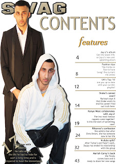
Contents page - completed
This image above is what inspired me on the layout of my contents page.
So my Contents Page is now finished.I am happy with the outcome but if I had more time, I would change the picture of him on the left. This is because the image is darker than the image on the right. However, to try and make both the images match, I used played around the colour to ensure both images are the same gradient. I done this by using photoshop. I done this by using the image tool and using the adjustments to play around the gradient, the brightness, the contrast until both images look similar. However, I wanted to include an editors note, but there was not enough space. By adding a drop shadow around both images, it shows the images are not floating and makes it stand out much more. By adding lines to seperate the features, it organises the layout of the text. Now looking back, the '17' does not stand out which if I could re do, I would add a drop shadow to make it stand out much more. I believe the masthead of the 'contents' could be much more bolder and I would change it. However, I believe more thought could've gone into the layout as there is not much really going on.
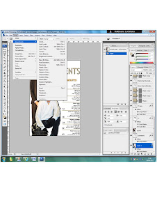
The print screen here explains on the tool I used to brighten my pictures. I had to change the brightness/contrast because originally, both images were not the same. However, if I had more time, I would have used Picasa. This programme is much more professional in terms of brightening and changing the colour of the images. However, I am happy with the outcome of both of images and the layout.
Friday, 16 March 2012
The next step...
My front cover is finally finished! Now it's time to complete my contents page. One problem I encountered was I forgot what font I used for my title on my front cover. So, as a result, what I planned originally to do didn't go quite to plan! Panic struck and I didn't know what to do. However, a convention that is used in many magazines is that they put the title of their front cover on their contents, but smaller than how it is portrayed on the front so it doesn't stand out as much.
Monday, 12 March 2012
Steps towards my final piece - front cover
Originally I had planned to go with a different picture that is currently on my front cover. The reason behind this is while I was showing my pictures to my teacher, she pointed out a picture that was a good potential shot. So as a result, I decided to go with her idea. The other image of Bilal M wearing a white jacket took me ages to cut out! After eventually cutting it out, I encountered a problem. Due to the jacket being white, it blended into the background so I had to put a shadow around it to make it stand out.
Getting a right colour scheme took me ages to do! Because my original colour scheme was yellow, white and black, I realised while adding the colours that yellow doesn’t work on well on a white background as the text was not readable. So, while experimenting with colours, I came across gold. I got this idea from the stripes on his white jacket. My title originally didn’t have the bold lines around it. This was due to the fact that I didn’t pay much attention to the title. My teacher gave my some advice and told me that the title doesn’t stand out and I should do something to make it big and bold. One thing which I found interesting was the positioning of the title. I had it in the middle and my teacher told me that normally on magazines, the title is not normally placed like this. I made it bigger to go across the top and realised that the title made my whole front cover stand out!
Normally the price is either on top or besides the barcode but nor black or gold stood out! Gold represents wealth and money which goes with the image of him wearing a suit. Black didn’t stand out due to the black suit Bilal M is wearing. Looking back at the magazine that inspired me, I realised that the issue date and the price was at the top underneath the title. This gave me an idea to add in my issue date and where to place my price. While doing my survey, one of my questions was ‘how much would you pay for a magazine?’ and one of my options was 50p-£1.00 and the majority of people chose that option. However, I believe that it is too cheap so I changed the price to £2.50.
These were steps towards my final piece:
These were steps towards my final piece:
I first started off by looking for a masthead on dafont.com. As my magazine is based on rnb genre, I was planning to use a graffiti font. However, I came across this font which stood out much more so I decided to go with this. I then cropped out both images on Photoshop. I added a shadow on the second image because as he's wearing white, he blended into the background which was a problem.
I then added the lines to where I should place my text. I used the colour gold as it represents, money and wealth. Also, as his jacket has gold lines which automatically blends in.
I started to experiment with the backgrounds. I couldn't go with too bright colours as it would look colourful and that's not a convention of a rnb magazine. As he's wearing a black suit, I thought a black background might work. However, I didn't like it and decided to change it back to white.
This is my final piece. I added a bar code, the price, the issue date and current, fresh artists at the bottom.
Most rnb magazine that I've looked at, had this at the bottom which makes it a convention. I am happy with my final piece, but I believe if I had a little more time, I would've maybe changed a few things and moved a few things around.
Subscribe to:
Comments (Atom)
.jpg)


